Brand guidelines
The start of our research into our approach UI begun with closely reviewing the brand-guidelines.pdf provided by the client. The brand guidelines set out rules that define the overall ICN brand and closely informed many of our design decisions.
Colours
The brand guidelines included a palette of colours (pictured below) divided into the primary and secondary categories.
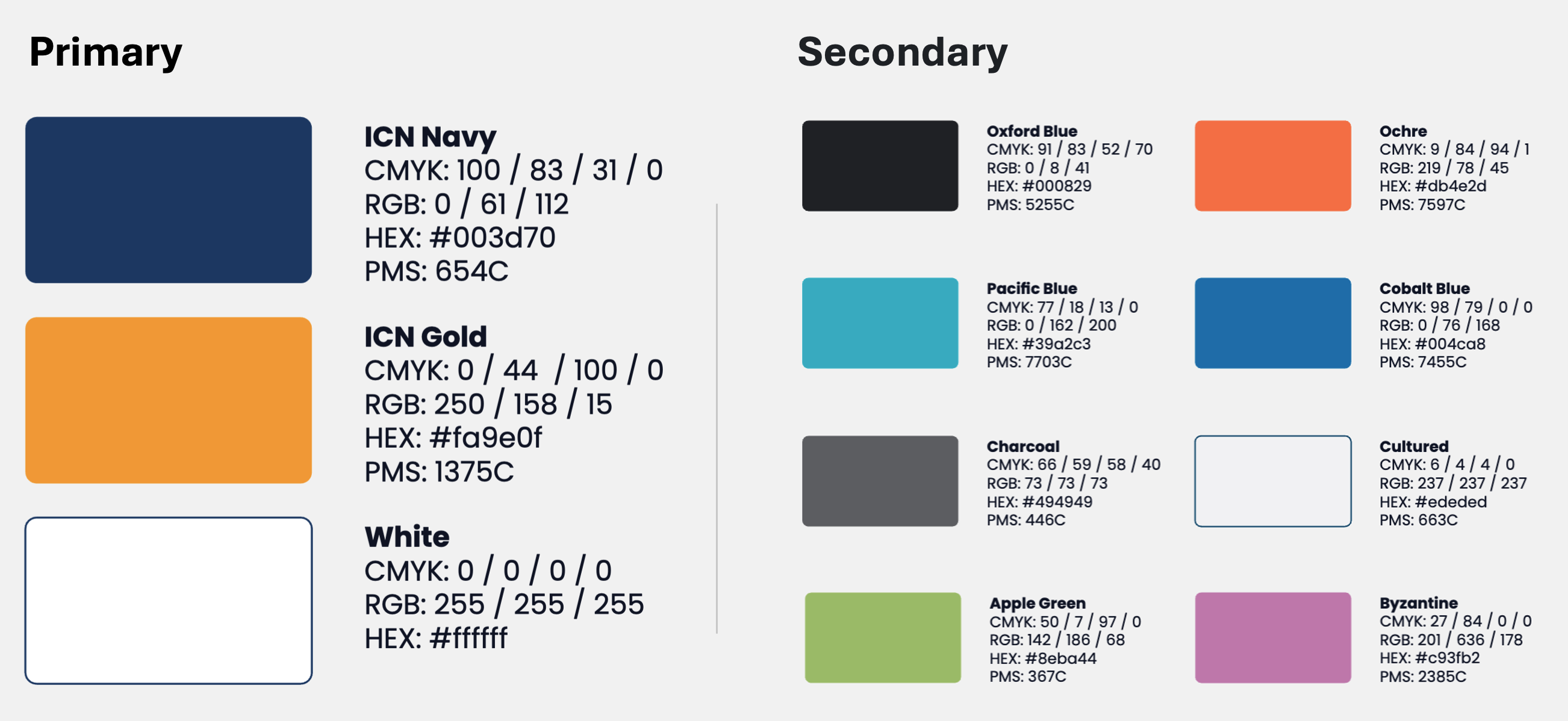
For simplicity, accessibility, and in line with good practices, we decided to use a relatively small set of colours throughout the application. In particular, we chose to primarily use the primary colours for all major UI elements (e.g., buttons, navigation bars, and key interactive components), reserving secondary colours for highlights, accents, or supplementary visual cues.
One element where we thought secondary colours might be well suited is in highlighting the different types of businesses on the interactive maps, in line with FR1 and FR3.
Logo
The brand guidelines included many alternatives/options for the ICN logo. We plan to use the logo sparingly but effectively, and always inline with the logo usage guidelines described in the document.
Custom Logo
Since ICN Navigator is a new product, it could be argued that it warrants its own logo. However, we have chosen to use the existing ICN Victoria logo without modification for several reasons:
- No team members have experience with professional logo design
- The ICN Victoria logo is already clear, simple, and recognisable
- The assets for the ICN Victoria logo are readily available and easy to integrate
That said, in any components or designs that incorporate the logo, we’ve aimed to leave room for a potential logo change in the future, should one be developed.
Font & Imagery
We will use the suggested font (Poppins) and follow the imagery guidelines.
Inspiration & References
A key part of the research and discovery step of our Design Process is sourcing resources to aid as references and inspiration both for user interfaces and the user experience / flow.
App Setup - Imprint
Imprint, a learning application, was suggested by the client (see: intro-slides.pdf) as a source of inspiration app setup which includes:
- Welcome screen
- Ability to create an account
- Membership tiers
- Sign-in
- Onboarding
- (basically everything before the user enters the main app)
Imprint’s streamlined onboarding process helped guide our thinking about a smooth entry point for users. In particular, we took note of how Imprint:
- Guides users step-by-step through the setup without overwhelming them
- Uses clean, minimal UI elements
- Presents a strong visual identity early in the experience
These ideas informed our early wireframes for features like first-time launch, account setup, and onboarding question format.
Maps - HappyCow
HappyCow, a community app for finding vegan food, was suggested by the client as a source of inspiration for the map component of the app (see FR1 and FR3) which includes:
- Map view
- List view (sorted by distance from current location)
- Filters
- Custom map icons
HappyCow shows how maps can function as both a sort of visual discovery and a practical search interface. Of particular note was their approach to filter design, which we identified early on as a design challenge as we were unsure how to present filters in a way that is powerful and user friendly.
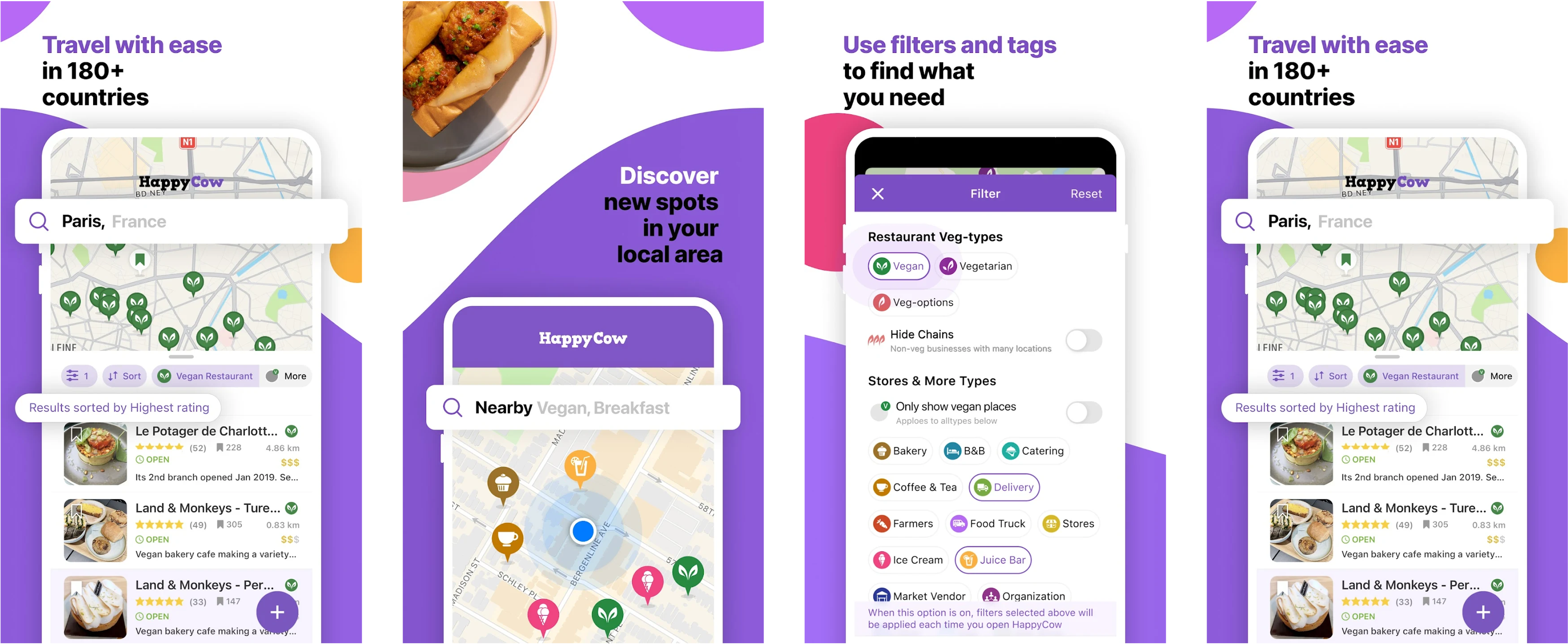 Selected examples from HappyCow’s Google Play store listing.
HappyCow provides a wide range of options (categories, tags, and toggles) without overwhelming the user, largely through nice visual grouping, consistent iconography, and clear toggle states.
For ICN Navigator, the challenge is enabling users to filter businesses by type, industry, or other attributes (see FR3). Using this as a source of inspiration, we noted that our approach to filters should:
- Be intuitive to use on mobile and desktop
- Avoid clutter by using icons/colours and grouping related options
- Allow users to easily reset or adjust their selections
NOTE: since HappyCow is a paid app (at least on iOS), we were not able to access the app directly, but we were able to get a reasonable idea of what the app looks like based on images online and in their app store listing and product description on their website.